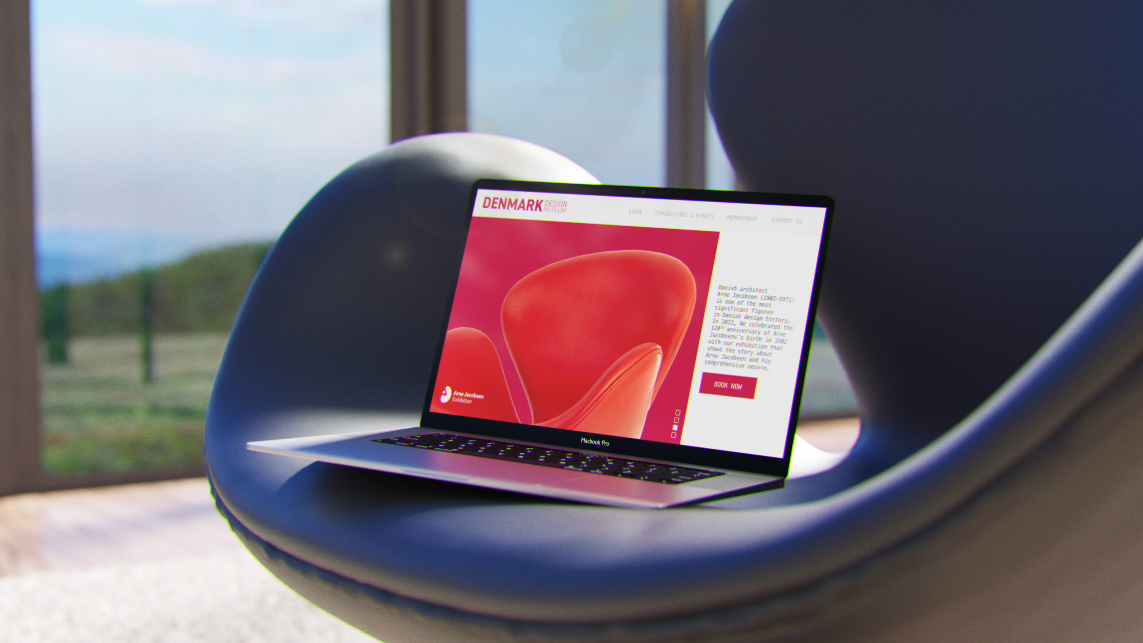
Originally developed during my studies at Kingston College, this conceptual exhibition celebrates the work of Danish designer Arne Jacobsen. I’ve recently revisited and redesigned the entire project as a way to reflect on my growth and evolving design approach.
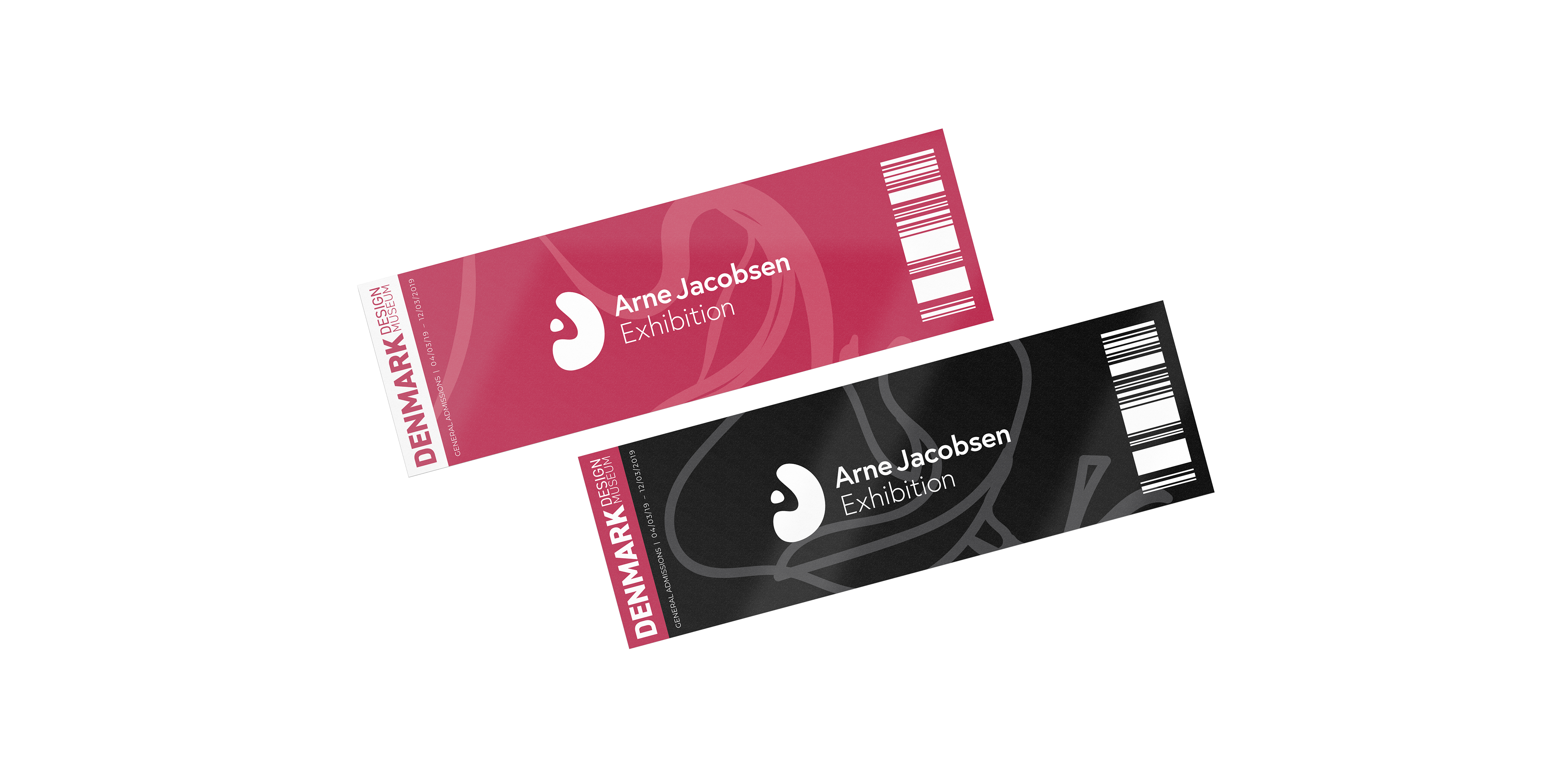
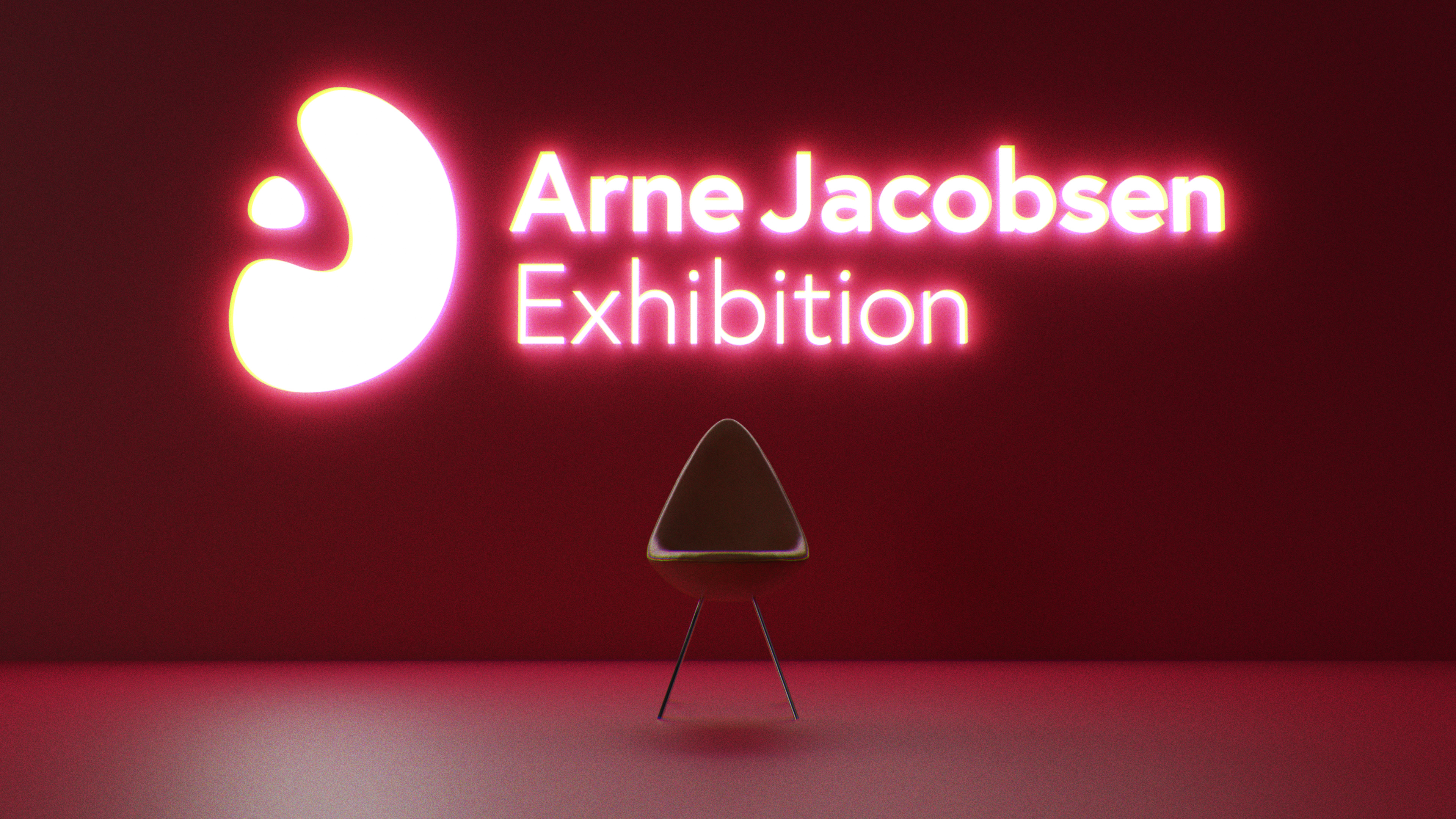
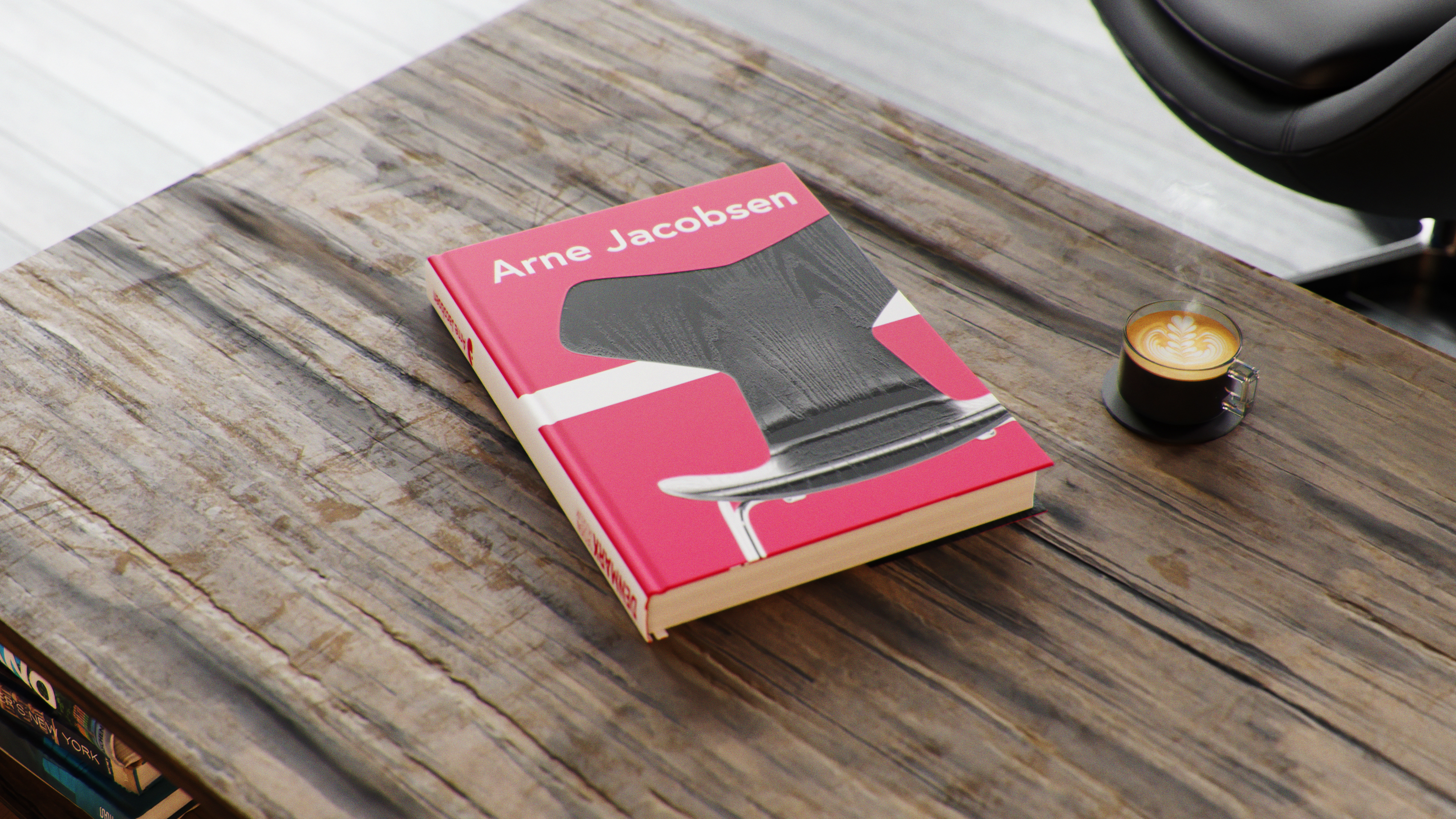
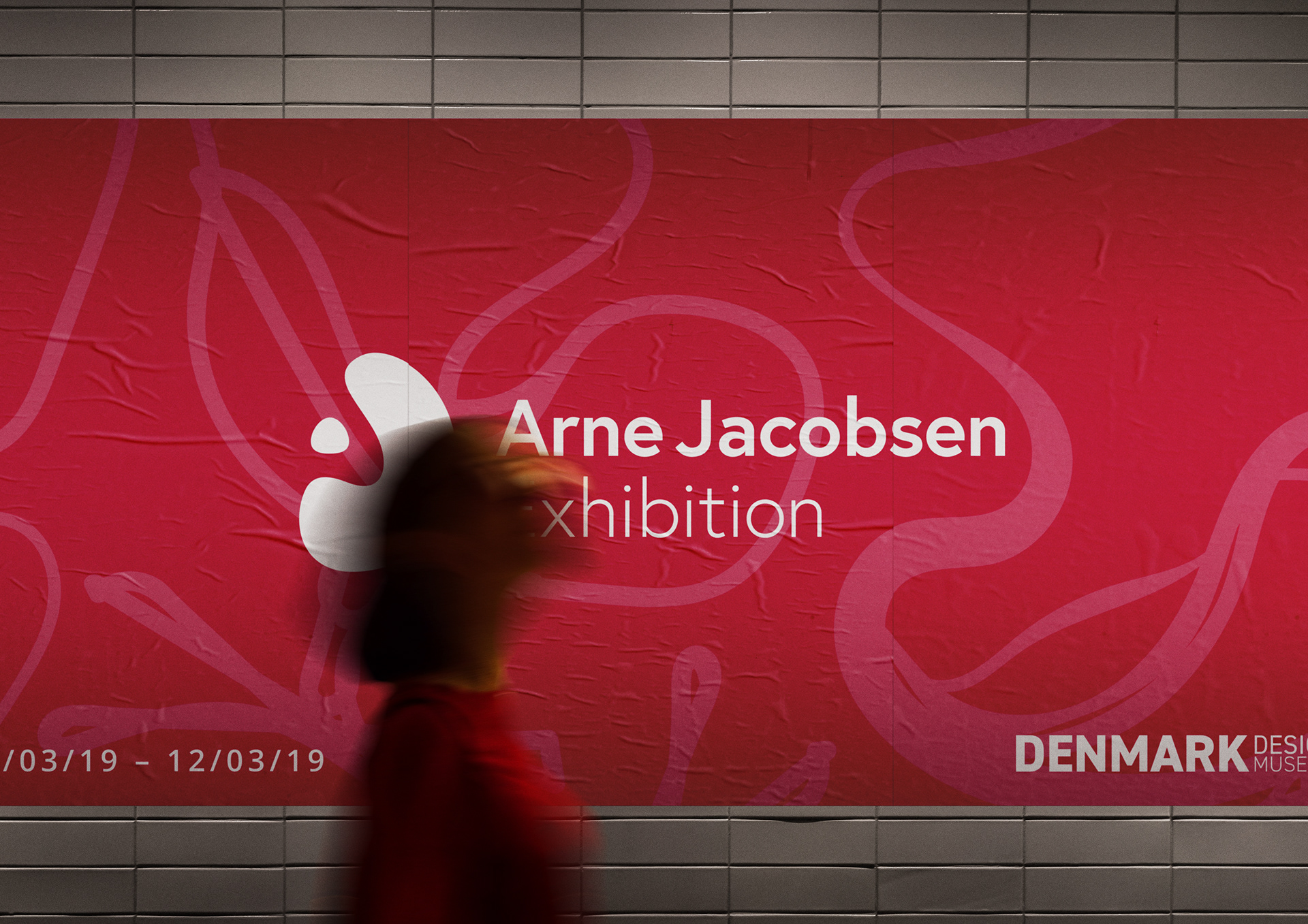
The visual identity is inspired by Jacobsen’s iconic forms. The logo merges the silhouette of the Egg chair with a circular shape referencing his signature lamp—together forming a minimalist scene. Within this, the letter ‘J’ takes the form of the chair, while the ‘A’ is revealed through negative space—subtly embedding Jacobsen’s initials into the mark.
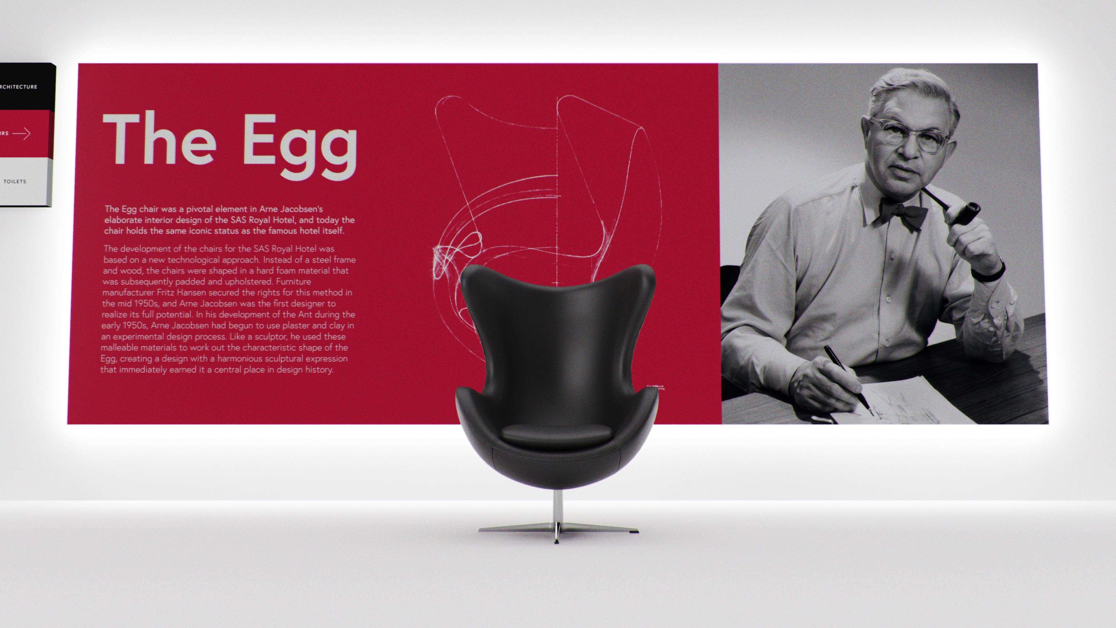
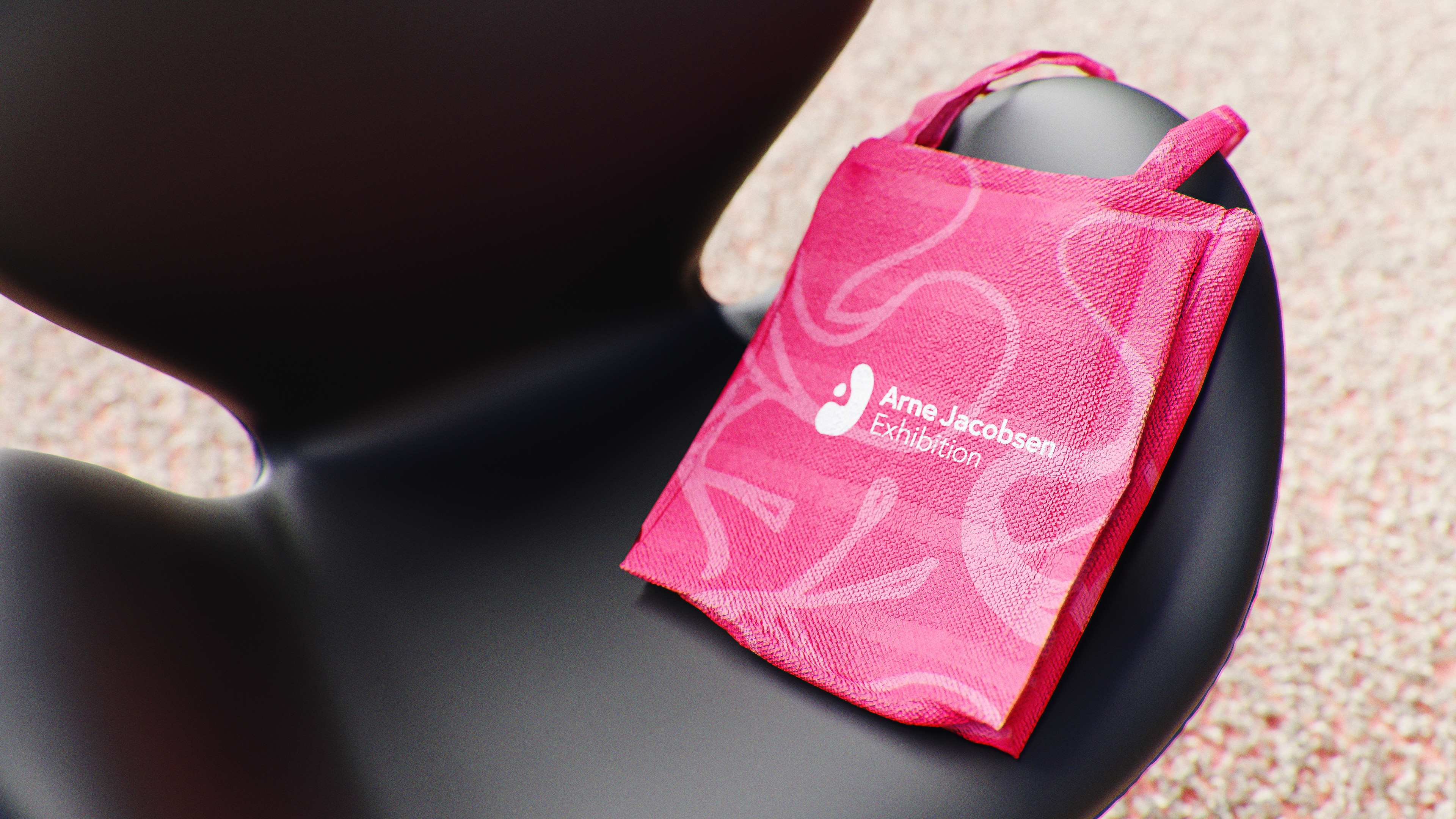
The overall branding draws from the geometry of his furniture and the red-and-white palette of the Danish flag, paying tribute to both his design language and national heritage.